 |
|
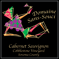
Domaine Sans-Socui Logo & Label
Challenge: Design a logo and wine label for a small Sonoma winery that had a care free and sophisticated feel.
Solution: A reclining Bacchus toasting the viewer drawn in simple Cubist lines and shapes. The color palette was inspired by the leaves, grapes, wine and sun. The gold lines were then printed in actual gold. |
| |
|
 |
|
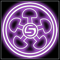
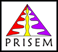
PRISEM Logo
Challenge: Design a logo for a web application that simplifies data analysis and provides decision making support.
Solution: Reinforcing the application name, I imagined how a prisem breaks light into descrete waves that enable one to see things clearly; hence the golden ray of clarity.
|
| |
|
 |
|
Gulf Lubricants Web Ads
Challenge: Design a series of promotional ads for the web that caught the users eye.
Solution: Intentionally avoiding the usual men looking at engine imagery of the industry, I used icongraphic shapes and primary colors so that users would be drawn to read and participate the promotions.
|
| |
|
 |
|
Chevron Distribution Center Maps
Challenge: Design maps to their distribution centers that could be viewed on the web and easily printed.
Solution: Stick to primarily gray scale imagery and remove smaller, less important streets that clutter the image. |
| |
|
|
|
|
Emoticons
Challenge: Draw expressive faces using a limited color palette in 32x32 pixel space for messaging board system.
Solution: Use expressive lines for facial features while incorporating color so that users can more quickly identify emotional states. |
| |
|
|
|
|
Business Icons
Challenge: Create icons that identify businessness on maps for an online address book.
Solution: Use silhouetted shapes for easy recognition while using gradients or details to add elegant quality to images. |


 NEW MEDIA